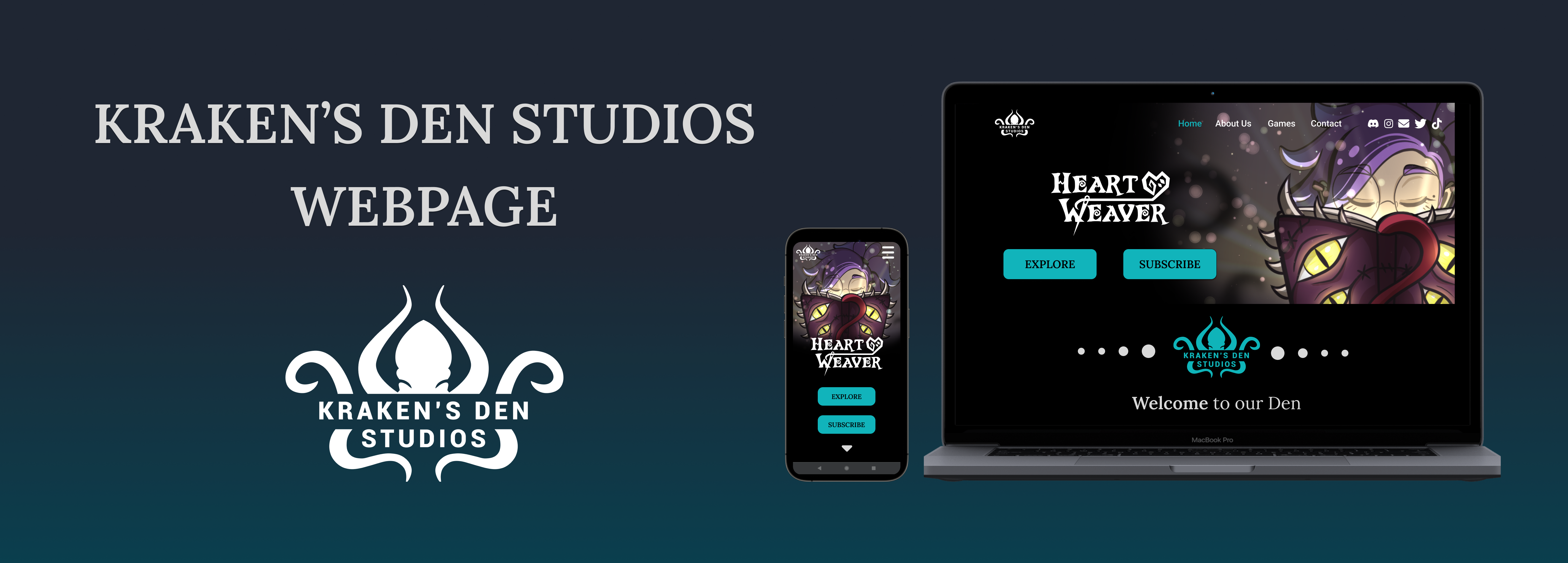
Designing Kraken's Den Studios Web!
This design has been made for my personal project at Kraken's Den Studios, where I work as UI/UX Designer.
In this project, I'm also working as part of the Front-End team. The web is actually in development using REACT.
Don't be shy and visit the Kraken here!
Kraken's Den Studios has started to grow! So we realised that a webpage is needed, so I started to sketch ideas and shared them with the team!
The "pet" for the company is a Kraken, and the turquoise was a must in this case! I opted for a elegant dark web, imitating the depths of the sea.
At first, I wanted to make a complex interface, in which you could enter a real Den and find the Kraken inside!! but I descarted the idea as it was difficult (almost impossible hehe) to do it in mobile phone!
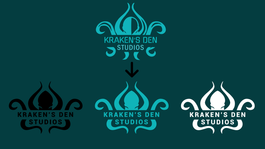
Designing the Logo
Thanks to the guidance provided by LevelUp's mentoring, I have been able to refine the initial model, streamlining the design process and achieving balance between colors and fonts.
Moreover, I made a deliberate choice to opt for a simpler and more legible font, ensuring that the logo maintains its clarity even when scaled down to smaller sizes.
"Paper" Wireframes

Digital Wireframes
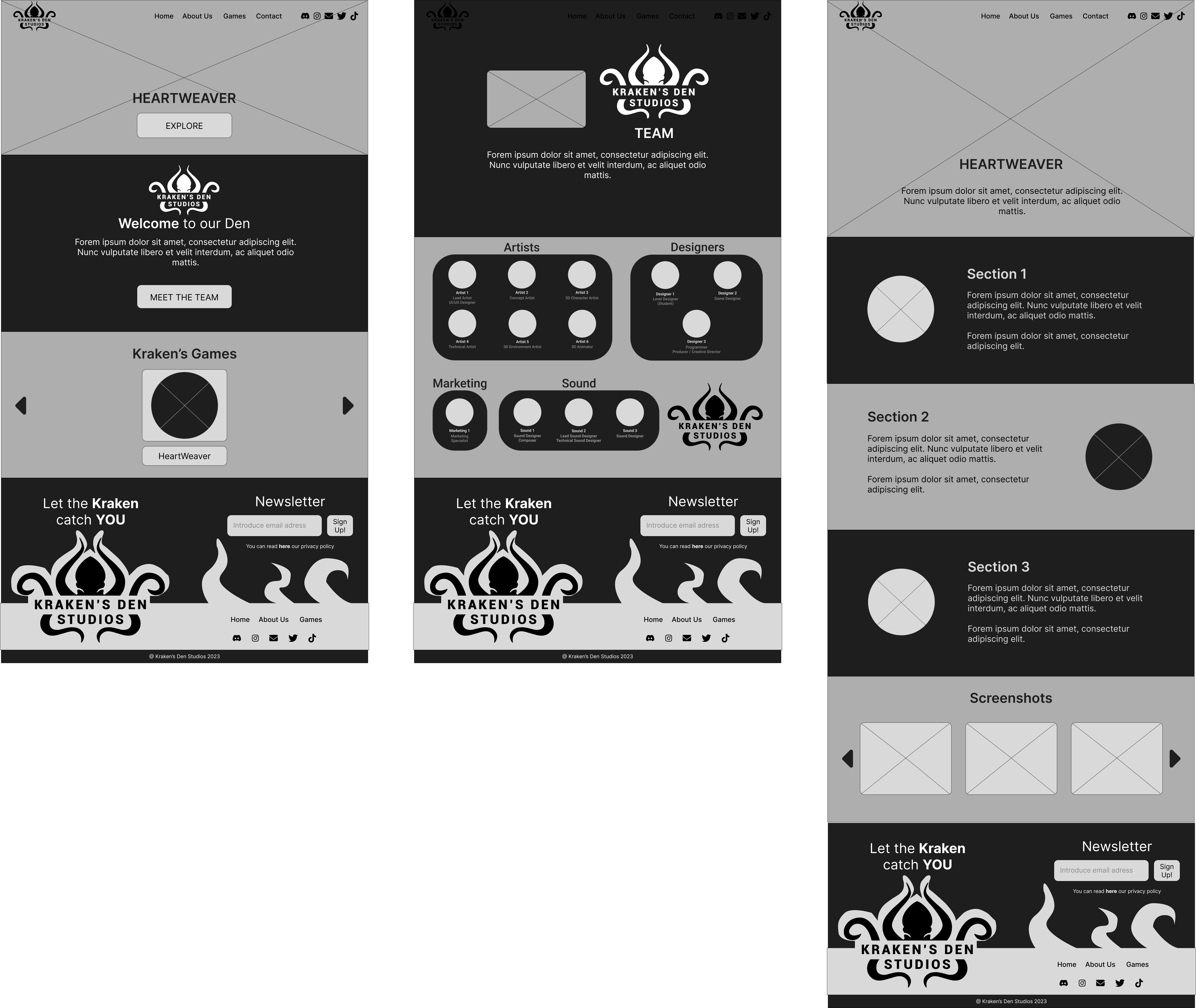
When we did the first tests, we realised that there was not enough call to action to our principal objective, subscribers!
The model was a bit modified later on, and a button was added at the homepage, as well as in the lateral bar.
You can see the low fidelity prototype for desktop here!
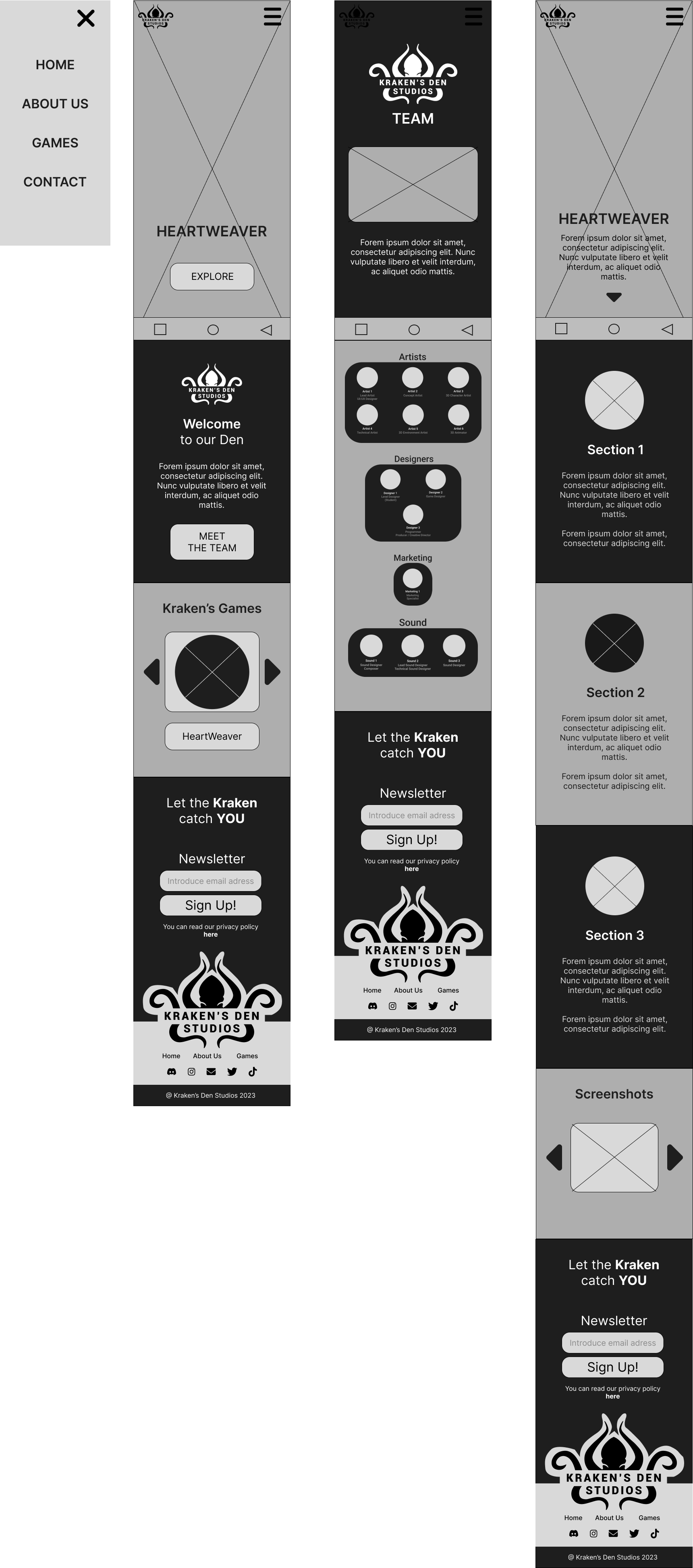
You can see the low fidelity prototype for mobile here!
Mockup
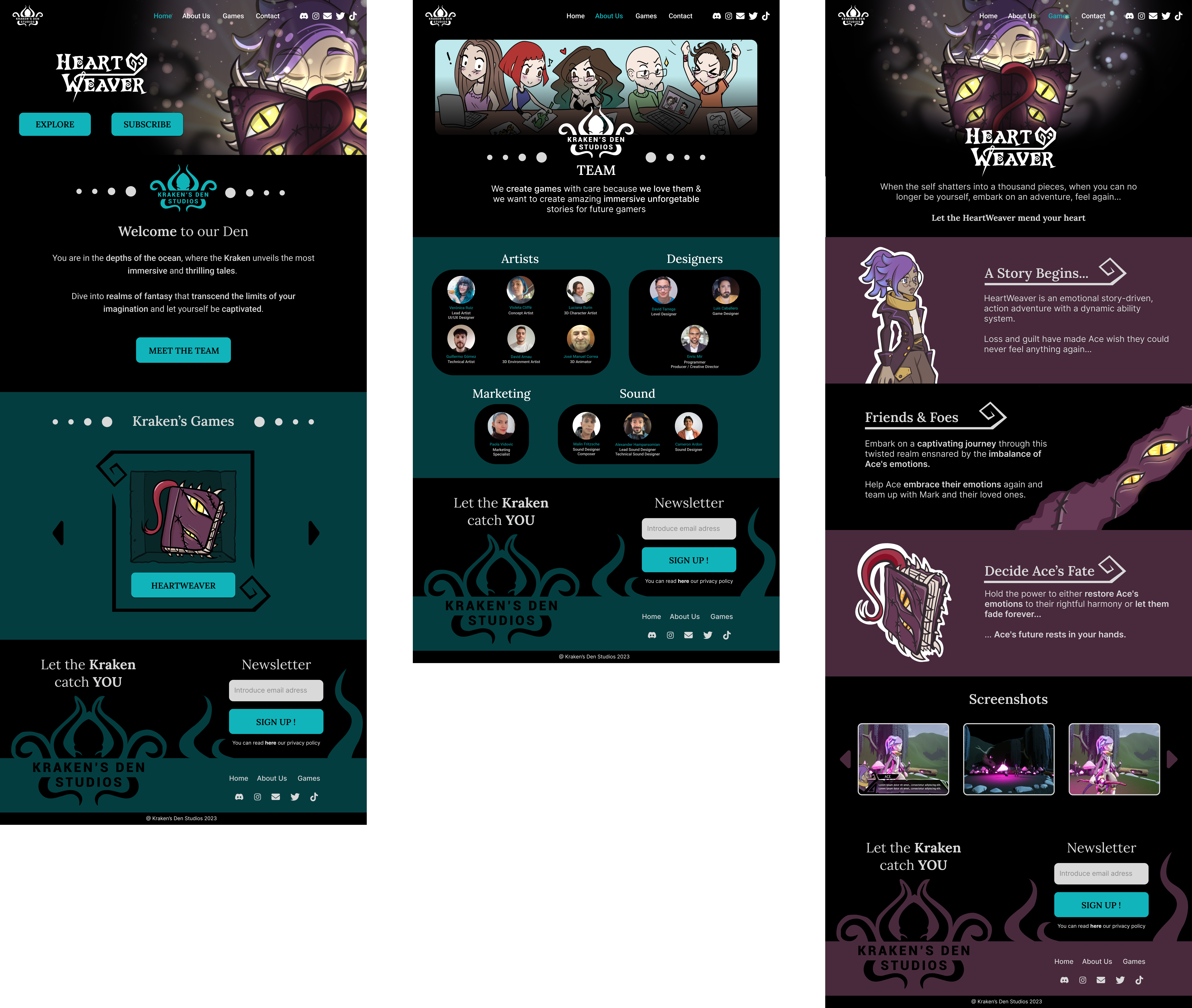
As I mentioned before, I wanted that the page felt like you were diving in the dephts of the oceans, while traveling through the Kraken's Den.
The Individual page for the game itself, HeartWeaver, has a purplish and dark color palette as I tried to mix the feel of the game (and it's color palette) with the overall look for the page!
The distribution for the footer was also changed for increasing accessibility! The letters are now bigger and the privacy policy is difficult to miss!
You can see the high fidelity prototype for desktop here!
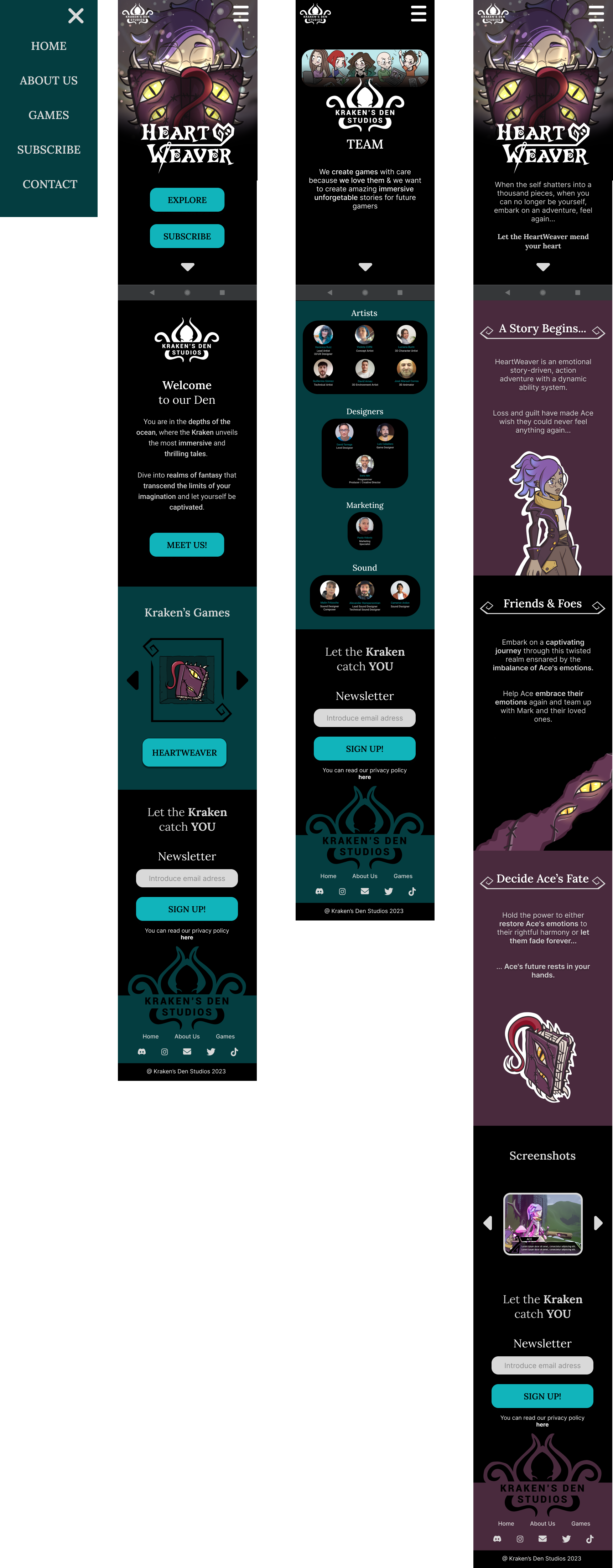
You can see the high fidelity prototype for mobile phone here!
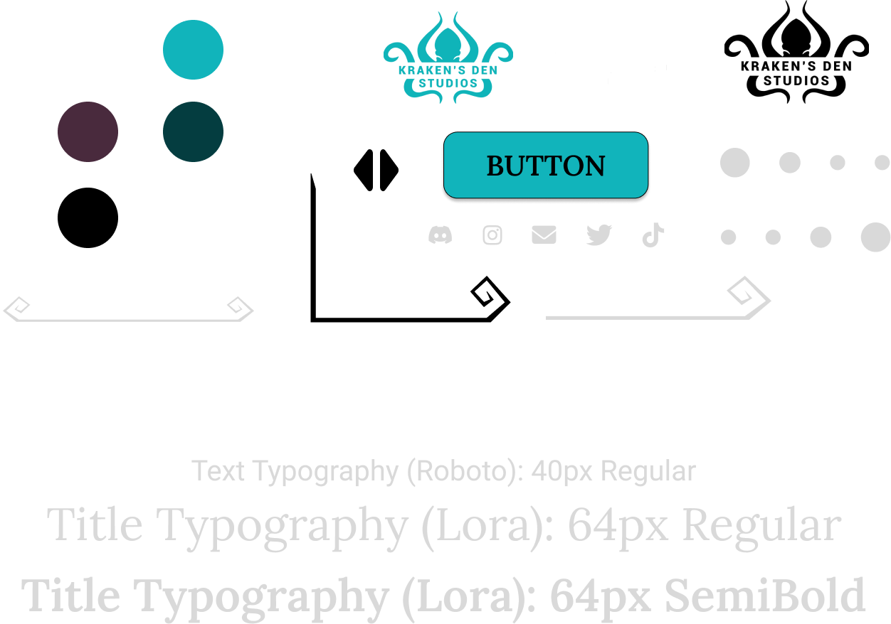
Sticker Sheet
Takeaways
Throughout this project, I have worked with Figma, Adobe Illustrator and Clip Studio Paint for illustrations. The web is responsive so I did two models, as there are different SVG's and icons for each variation.
The project was shared with other developers since the first steps, so i made sure that there won't be problems with coding!
Next Steps
We are now building the web!
When the web is ready, we will proceed to do more testings and measure the level of engagement for the newsletter!
Thank you for reading!!