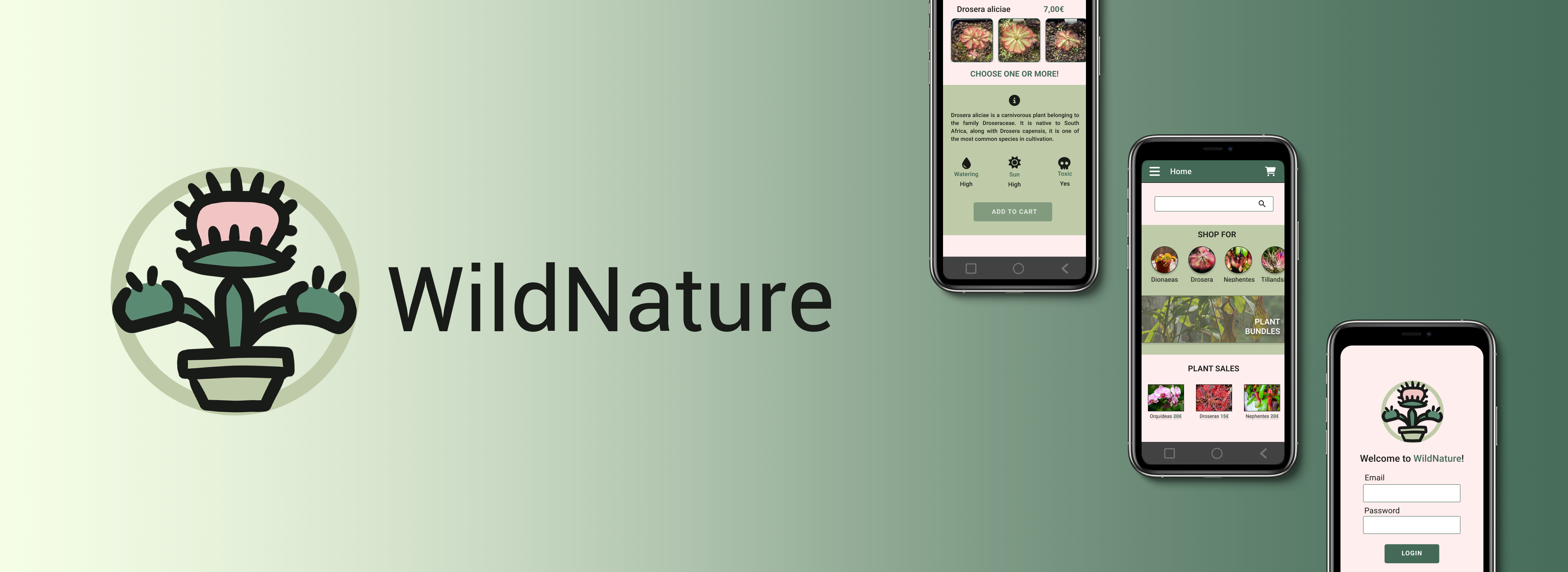
Designing an exotic flower shop app!
This project is the result of my active engagement in the official Google UX Design Certificate program on Coursera, where I have strived to make the most of every opportunity presented by this project during its two-month duration as a UX Designer.
I decided to give it a twist from the first moment I started and I got down to work to do some small interviews to find out what pain points were repeated in people who decided to buy plants online while I made the competitive audit report.
The answer was clear: little or nule information about the care and characteristics and little confidence not being able to see the plants you are going to buy.
Ahá! that's it! In this application, we will give information about the plants and let the user see a REAL photo of the plant users are going to buy!
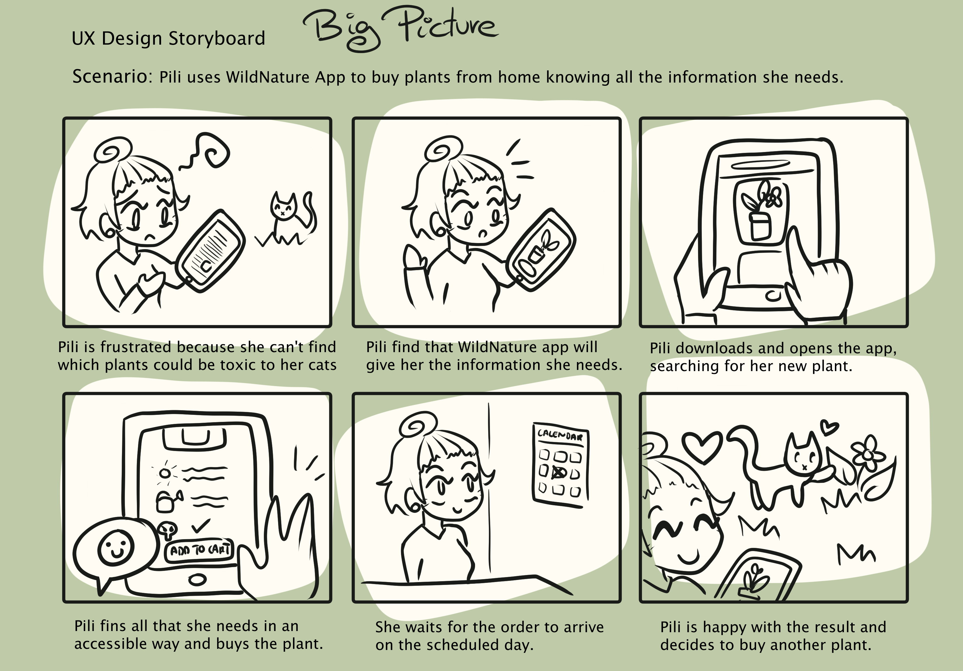
Our User Personas


A little story about Pili
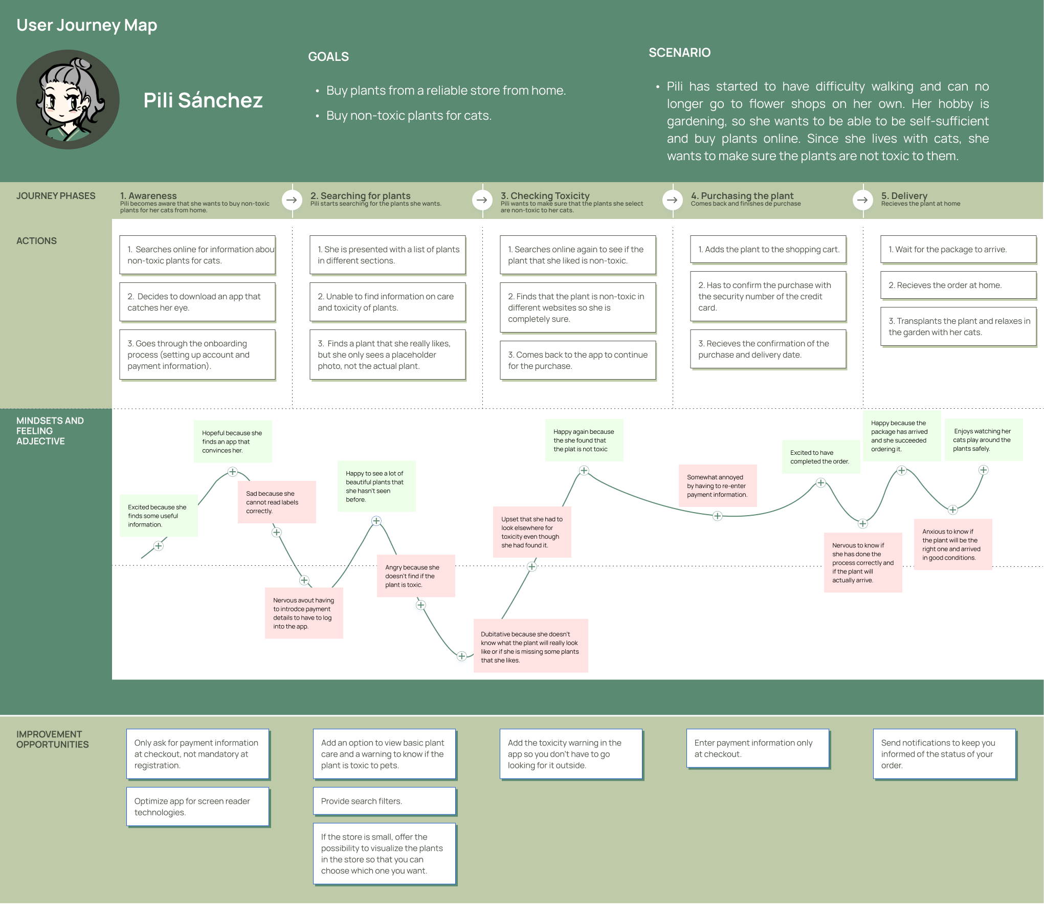
User Journey Map
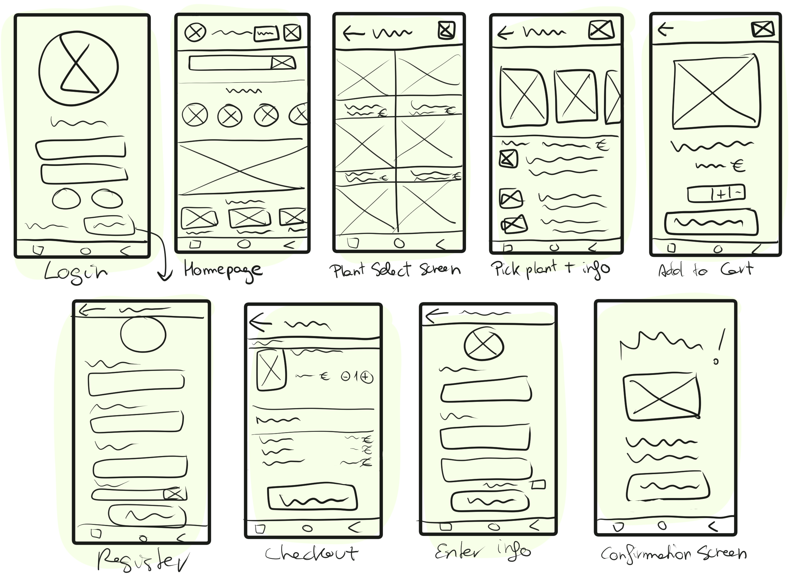
"Paper" Wireframes
Digital Wireframes
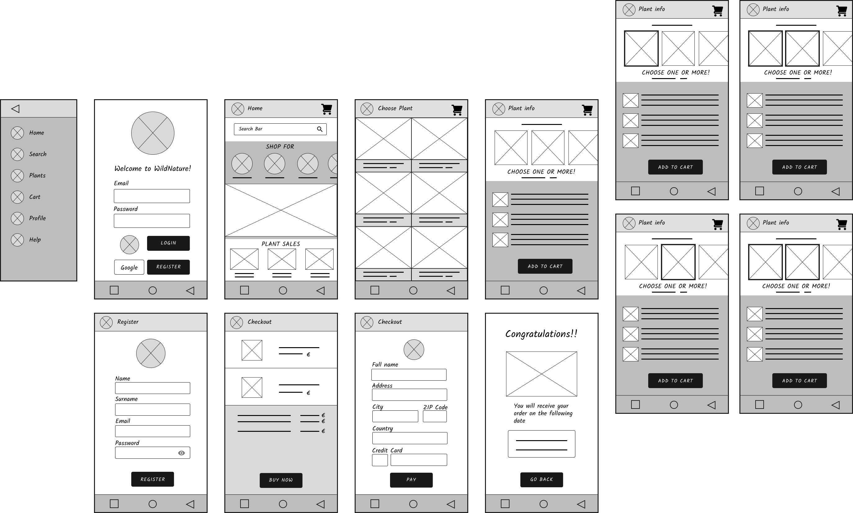
At first, there wasn't a lateral bar, but I decided to add it for accessibility, as some people needs it to navigate through the app.
Also, you couldn't select more that two plants at a time, and this bothered the users that tested the low fidelity prototype, so I added that option.
You can see the low fidelity prototype here!
Usability study: Findings
I conducted an unmoderated usability study remotely in Spain with a group of five participants. The study lasted for 5 to 10 minutes, during which each participant was asked to place an order for a plant and search for information.
In that study, it could be concluded that:
- People with vision impairments could need a navbar, so we added it
- People didn't want to return to homescreen after adding to cart, so the screenflow was iterated and changed.
- People want to be able to select more than one plant at a time, so we added that option.
All this changes are present in the digital wireframes that were shown before!
Mockup
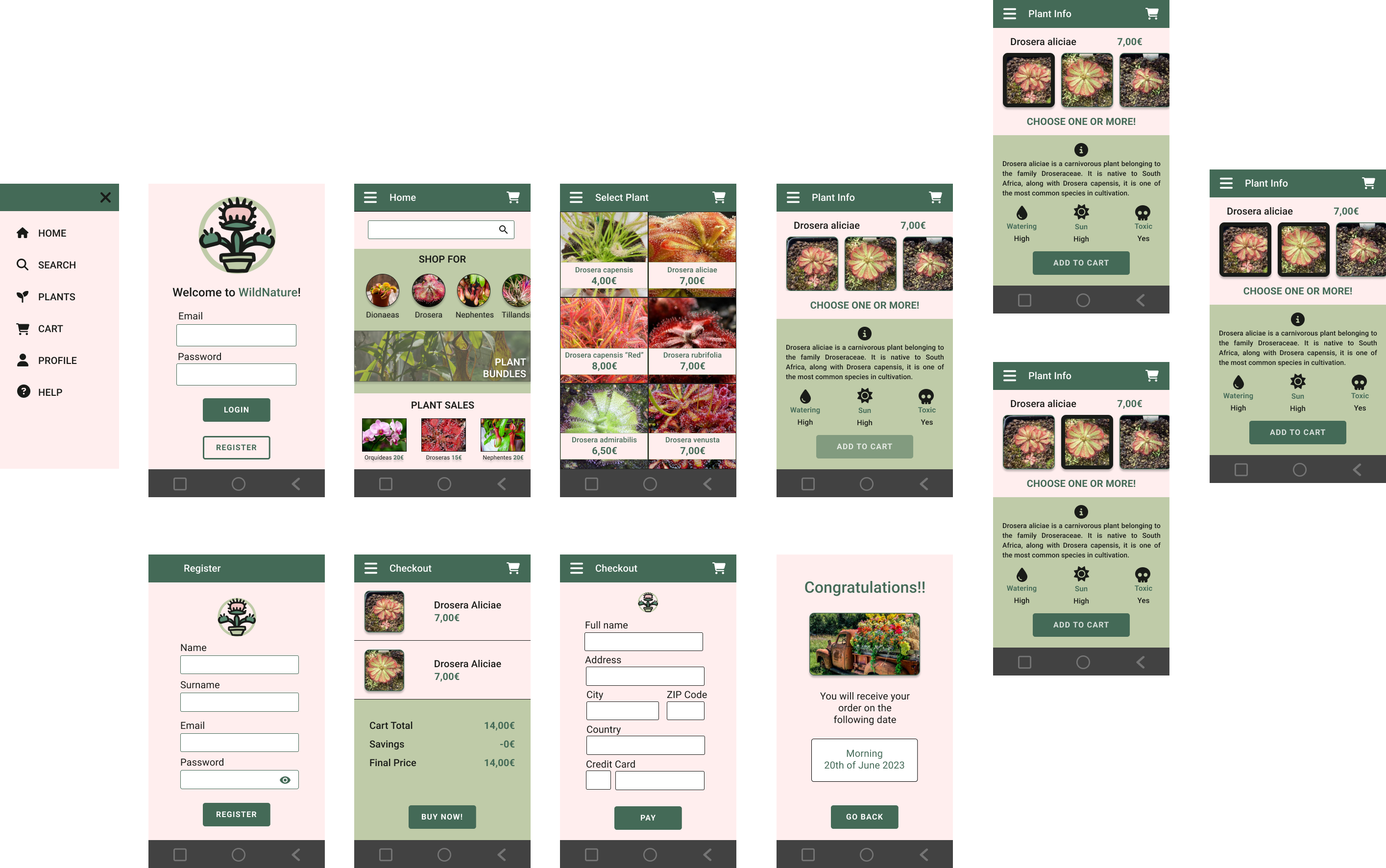
In the process of designing the mockup, I created a logo to represent the brand's identity, with a particular focus on incorporating shades of green inspired by nature in all the app. Additionally, I ensured that the chosen color combinations provided the highest level of accessibility by striving for triple A results in terms of color contrast.
You can see the high fidelity prototype here!
Takeaways
Throughout this project, I have been able to acquire a solid foundation in UX design and have learned to use FIGMA effectively. Additionally, I have started to familiarize myself with usability testing.
Overall, feedback from users who have seen the project and its evolution suggests that incorporating real photographs would be a significant advancement for plant-selling applications and websites. Many believe that if they order plants online, they may receive specimens that are undesirable or unpopular, which is why they prefer to make in-person purchases. Furthermore, these types of plants require specific care instructions that are not readily available, especially for users who are less tech-savvy.
Next Steps
Ideally, it would be great to conduct further usability testing to determine if the identified pain points have been effectively addressed. Additionally, it would be beneficial to incorporate a section with general plant care for different types of plants, providing more specific details about their individual needs in the information section.
Thank you for joining me on this journey! I hope you found this application as interesting as I did!